
English
Header Main Structure
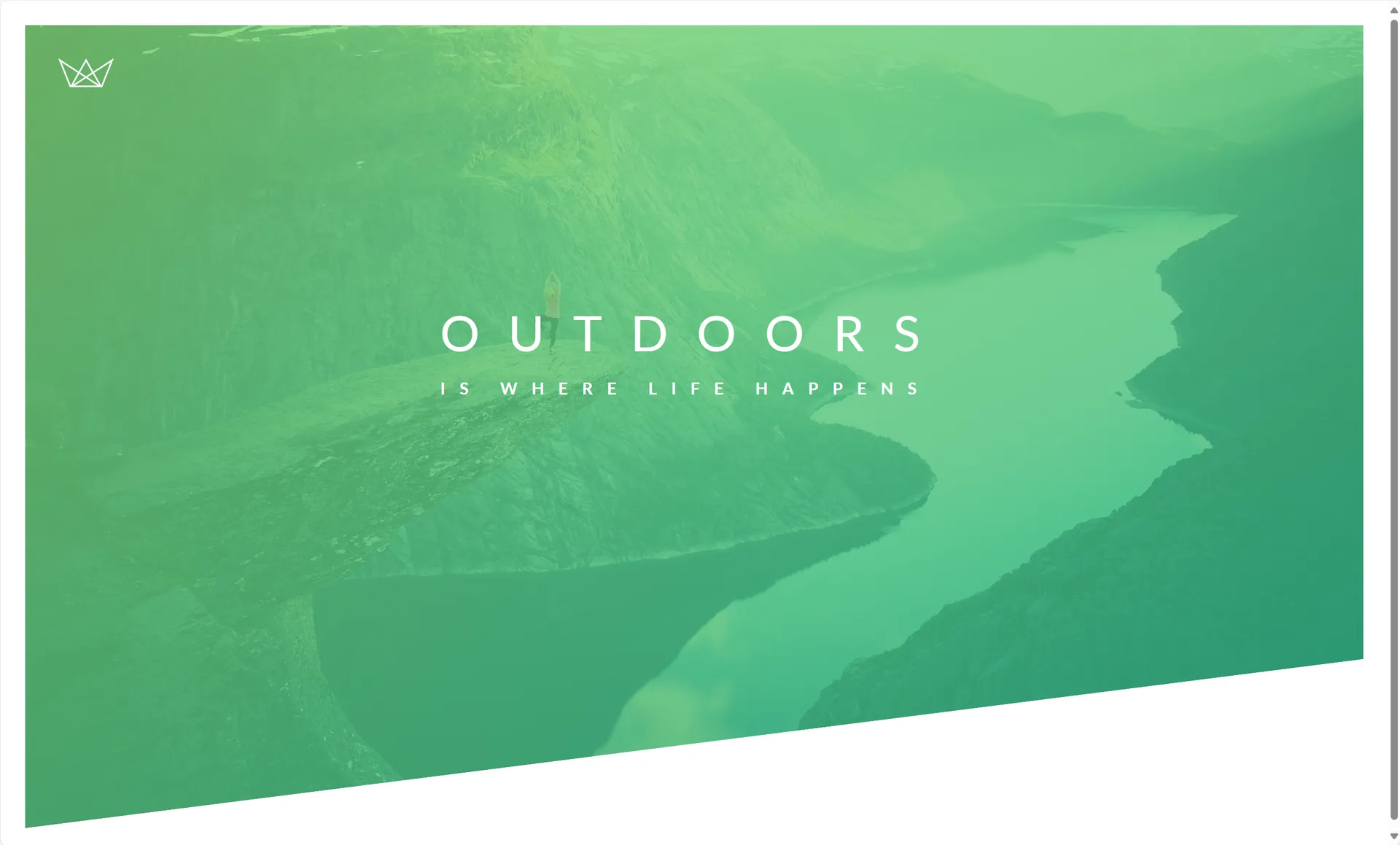
First, create a header tag and give the header a selector named header.
html
<header class="header">
    <div class="logo-box">
        <img src="img/logo-white.png" alt="Logo" class="logo">
    </div>
    <div class="text-box">
        <h1 class="heading-primary">
            <span class="heading-primary-main">Outdoors</span>
            <span class="heading-primary-sub">is where life happens</span>
        </h1>
    </div>

</header>Then write the following in the style section.
css
/* 清除浏览器默认边距 */
* {
    margin: 0;
    padding: 0;
    box-sizing: border-box;
}

/* 页面基础样式设置 */
body {
    font-family: "Lato", sans-serif; /* 设置全局字体 */
    font-weight: 400; /* 字重为正常 */
    font-size: 16px; /* 基础字号 */
    line-height: 1.7; /* 行高,提升文字可读性 */
    color: #777; /* 文字颜色 */
    padding: 30px;
}

.header {
    height: 95vh; /* 高度为视口高度的95% */
    background-image: linear-gradient(
            to right bottom,
            rgba(126, 213, 111, 0.8),
            rgba(40, 180, 133, 0.8)),
    url("../img/hero.jpg"); /* 设置背景图片 */
    background-size: cover;
    background-position: top;
    position: relative;

    clip-path: polygon(0 0, 100% 0, 100% 75vh, 0 100%);
}The following highlights the things I saw for the first time.
font-family: "Lato", sans-serif;
Sets the font priority order:
- Prefer the
"Lato"font; - If it is unavailable, use the system default sans-serif font.
clip-path: polygon(0 0, 100% 0, 100% 75vh, 0 100%);
These are the coordinates of each point of the image, in clockwise order.
Then, linear-gradient, set inside background-image, is the CSS function used to create a linear gradient background. It lets colors transition smoothly in one direction and is commonly used to beautify buttons, backgrounds, borders, and so on.
css
background: linear-gradient(direction, color1, color2, ...);Next comes the logo in the top-left corner and the heading in the center.
css
.logo-box {
    position: absolute;
    top: 40px;
    left: 40px;
}

.logo {
    height: 35px;
}

.text-box {
    position: absolute;
    top:40%;
    left: 50%;
    transform: translate(-50%,-50%);//把元素放到中心
}

.heading-primary {
    color: #fff;
    text-transform: uppercase;//文字大写
}

.heading-primary-main {
    display: block;
    font-size: 60px;
    font-weight: 400;
    letter-spacing: 35px;
}

.heading-primary-sub {
    display: block;
    font-size: 20px;
    font-weight: 700;
    letter-spacing: 17.4px;
}First, the logo and the heading need to be placed in two separate div tags. Then comes the new concept.
css
.header {
    position: relative
}
.logo-box {
    position: absolute;
}
.text-box {
    position: absolute;
    top:40%;
    left: 50%;
    transform: translate(-50%,-50%);
}The parent container header uses relative positioning, and the child containers logo-box and text-box use absolute positioning. Then it is a matter of adjusting the child containers' positions.
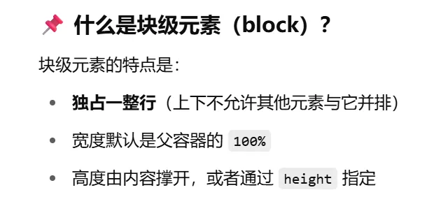
First, a note on the block-level element display: block;
Then here is one way to place the container in the center:
css
.text-box {
    position: absolute;
    top:40%;
    left: 50%;
    transform: translate(-50%,-50%);//把元素放到中心
}And the following places the logo in the top-left corner.
css
.logo-box {
    position: absolute;
    top: 40px;
    left: 40px;
}