English
Header Animation
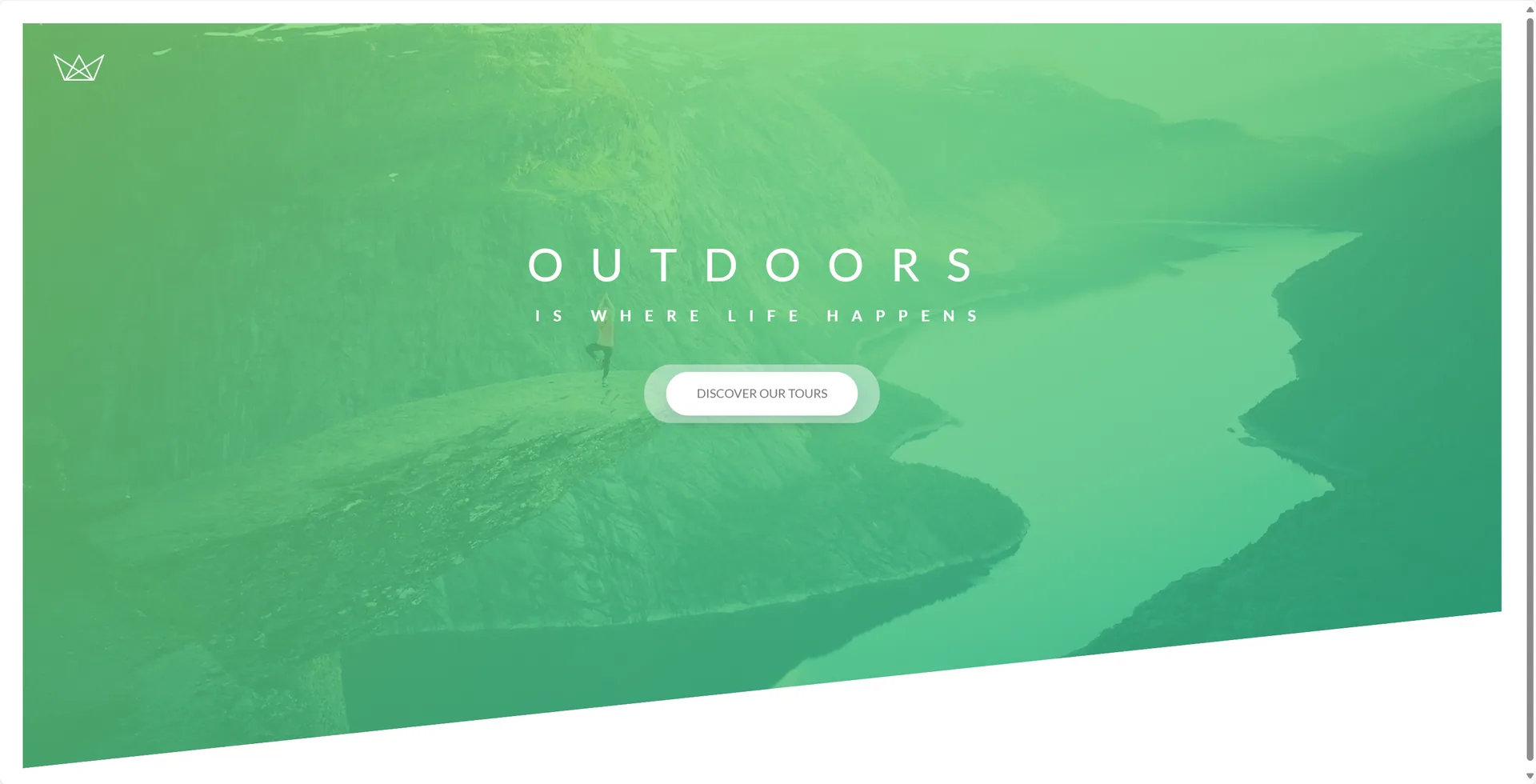
Now the animation effects for the heading and subtitle just mentioned have been added.
css
.heading-primary-main {
    display: block;
    font-size: 60px;
    font-weight: 400;
    letter-spacing: 35px;

    animation-name: moveInLeft;
    animation-duration: 1s;
    animation-timing-function: ease-out;
    /*
    animation-delay: 3s;
    animation-iteration-count: 3;
    */
}

.heading-primary-sub {
    display: block;
    font-size: 20px;
    font-weight: 700;
    letter-spacing: 17.4px;

    animation-name: moveInRight;
    animation-duration: 1s;
    animation-timing-function: ease-out;
}

@keyframes moveInLeft {
    0% {
        opacity: 0;
        transform: translateX(-100px);
    }

    80% {
        transform: translateX(10px);
    }

    100% {
        opacity: 1;
        transform: translate(0);
    }
}

@keyframes moveInRight {
    0% {
        opacity: 0;
        transform: translateX(100px);
    }

    80% {
        transform: translateX(-10px);
    }

    100% {
        opacity: 1;
        transform: translate(0);
    }
}Heading Animation
@keyframes is the core part of CSS animation, used to define the keyframes of an animation. Keyframes define the element's styles at different points in time, so the browser knows how to gradually change the element's styles during the animation.
The usage is the same as above: @keyframes is followed by the animation name, and then it is defined inside the classes of the two span tags. animation is the CSS property used to control element animation. With the animation property you can set the animation name, duration, iteration count, timing function, delay, and other parameters. It is a shorthand for @keyframes animations, used to specify which animation to apply. It can also be written in shorthand:
css
.heading-primary-sub {
    animation: moveInRight 1s ease-out;
}Then there is one thing you absolutely must know: how to use transform.
Button Styles
At this point a new thing needs to be introduced. The screenshot code is as follows:
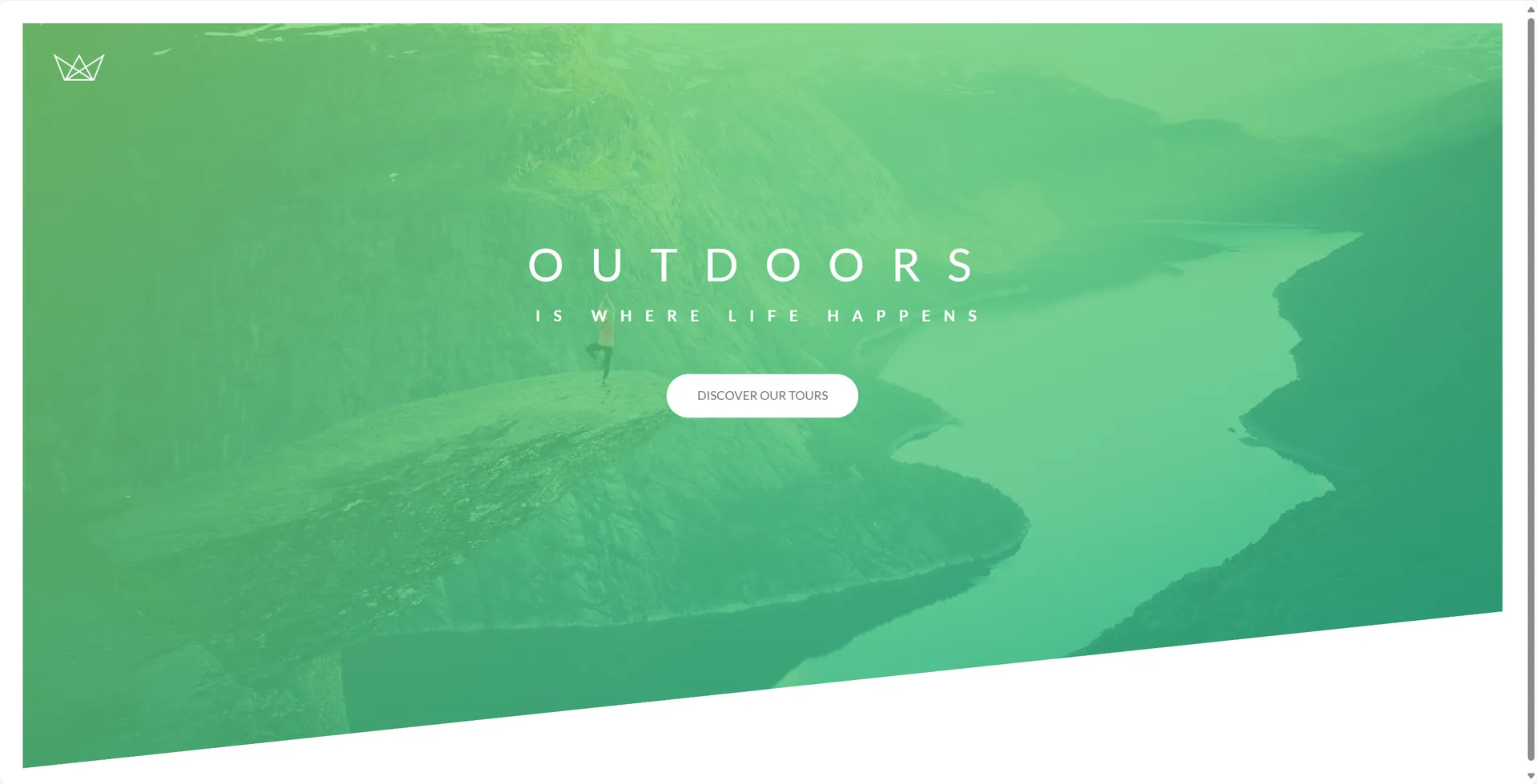
html
<div class="text-box">
    <h1 class="heading-primary">
        <span class="heading-primary-main">Outdoors</span>
        <span class="heading-primary-sub">is where life happens</span>
    </h1>
    <a href="#" class="btn btn-white">Discover our tours</a>
</div>css
.btn:link,
.btn:visited {
    text-transform: uppercase;//大写
    text-decoration: none;//取消超链接下划线
    padding: 15px 40px;//给超链接元素上下15px,左右40px的内边距
    display: inline-block;//行内块元素
    border-radius: 100px;
    transition: all .2s;
}

.btn:hover {
    transform: translateY(-3px);
    box-shadow: 0 10px 20px rgba(0,0,0,.2);
}

.btn:active {
    transform: translateY(-1px);
    box-shadow: 0 5px 10px rgba(0,0,0,.2);
}

.btn-white {
    background-color: #fff;
    color: #777;
}First, the btn btn-white naming convention is used.
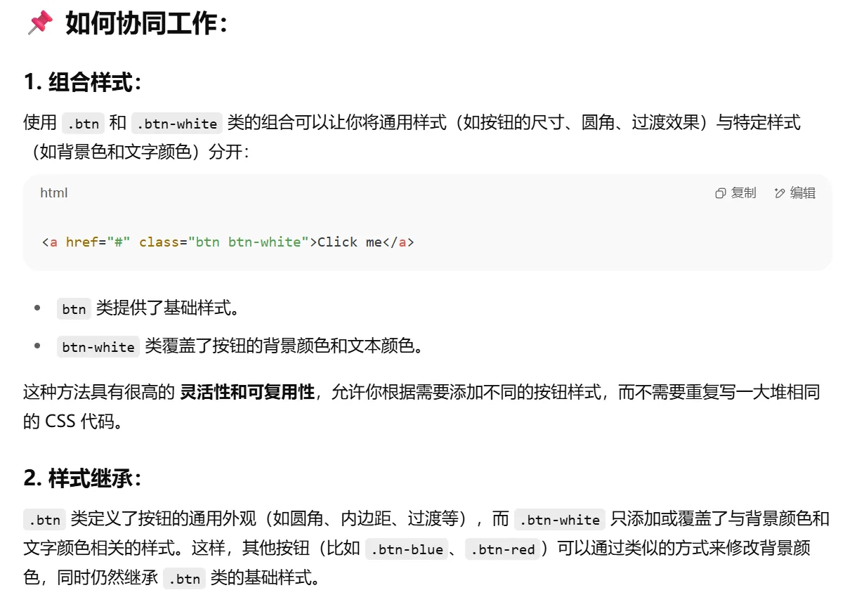
Let me talk about transition: all .2s; again in more detail.
Let me also mention the commonly used pseudo-classes.
| Pseudo-class | Description |
|---|---|
:link | Unvisited hyperlink (only applies to <a href>) |
:visited | Visited hyperlink |
:hover | When the mouse hovers over it |
:active | When the mouse clicks it |
:focus | When the element gains focus (e.g. via click or the Tab key) |
Finally, the meaning of box-shadow: 0 5px 10px rgba(0,0,0,.2);
- It adds a shadow effect, making the button stand out more on hover.
0 10px 20px: represents the shadow's offset and blur radius.rgba(0,0,0,.2)is the shadow color, black with 20% opacity.
The only logic for the mouse is this: when it moves over the button, the element shifts -3px and a larger shadow appears; when it is pressed, it shifts -1px and a smaller shadow appears. That's it.
As a supplement, opacity: 0; is a CSS property used to set an element's opacity. It controls how visible an element is, with values ranging from 0 to 1,
Button Animation
Now comes the more important part: pseudo-elements are introduced. These are not the same thing as pseudo-classes.
| Feature | Pseudo-class | Pseudo-element |
|---|---|---|
| Definition | Selects a specific state of an element, such as mouse hover or focus | Selects a specific part of an element or generates a virtual element |
| Usage | Usually expresses an element's dynamic state (e.g. :hover, :focus) | Used to insert virtual content into an element or style part of an element |
| Selector syntax | Uses a single colon :, e.g. :hover, :focus | Uses a double colon ::, e.g. ::before, ::after |
| Common examples | a:hover, input:focus, :nth-child(1) | div::before, p::first-letter, ::after |
| Does it really exist in the DOM | The element's state is dynamic and tied to a real element in the DOM | Pseudo-elements are not in the DOM; they are only virtual content in CSS |
| Scope | Controls element states, such as hover and selected | Controls part of an element's content or inserts content into an element |
css
.btn::after {
    content: "";
    display: inline-block;
    height: 100%;
    width: 100%;
    border-radius: 100px;
    position: absolute;
    top: 0;
    left: 0;
    z-index: -1;
    transition: all .4s;
}

.btn-white::after {
    background-color: #fff;
}

.btn:hover::after {
    transform: scaleX(1.4) scaleY(1.6);
    opacity: 0;
}

@keyframes moveInBottom {
    0% {
        opacity: 0;
        transform: translateY(30px);
    }

    100% {
        opacity: 1;
        transform: translate(0);
    }
}

.btn-animated {
    animation: moveInBottom .5s ease-out .75s;
    animation-fill-mode: backwards;
}First, a new class is added to the button.
html
<a href="#" class="btn btn-white btn-animated">Discover our tours</a>Now the animation is bound to this new class. Another thing to note is that this button's animation is triggered after a 0.75s delay, and you must use animation-fill-mode: backwards; so that before the animation starts, the element shows the animation's starting state. Once the animation begins, it animates according to the predefined keyframes.
Next, when introducing the after pseudo-element, it must have content even if it is empty, otherwise the pseudo-element will not display. Its positioning is absolute, so the parent element also needs relative positioning.
css
.btn:link,
.btn:visited {
    position: relative;
}Next, set the position so the layer displays beneath the element, then set the color, and then the change effect for when the mouse moves over it. These three correspond one-to-one with the original classes. Finally, give hover a fade-in and fade-out effect and the feature is done.
The final result is as follows.